
INFORMATION ARCHITECTURE · SOLO CONCEPT
Balanced Lens
A bilingual card-sorting session challenged the default hierarchy and inspired a more customizable approach to news navigation.
Role
UX Designer / Information Architect
METHODS
Competitive analysis, card sorting, information architecture mapping, and user-flow design
PROJECT STATUS
Testable information-architecture concept
THE PROBLEM
News structures can overwhelm people.
Traditional news structures can overwhelm users and leave little room for personal context. The project explored whether navigation could offer more relevance, agency, and room for different ways of organizing information.
Research
Observe how people make sense of the news.
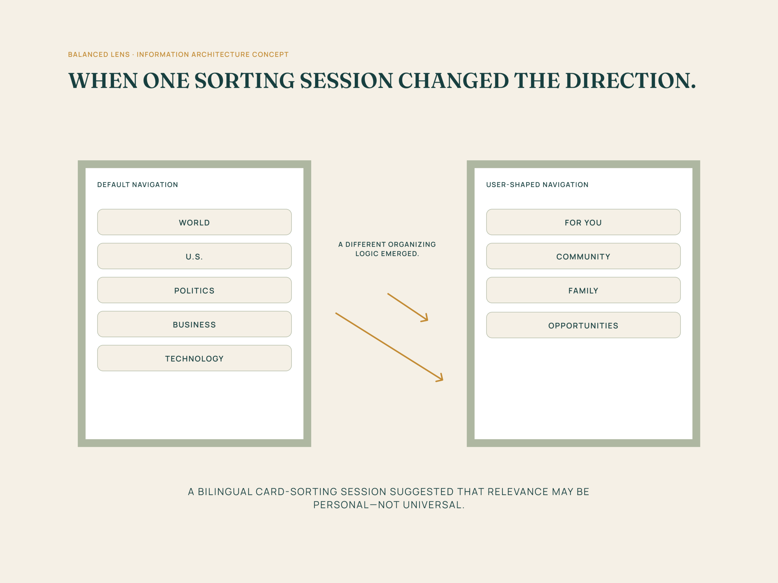
I reviewed established news platforms and conducted card-sorting exercises to understand how people grouped, named, and prioritized information. One bilingual session surfaced a different organizing logic from the default media hierarchy.
DIRECTION SHAPED
Personal relevance can reshape the hierarchy.
Default labels are not neutral.
Common news categories may feel familiar, but they do not always reflect what a person considers most relevant or useful.
Context changes categorization.
One bilingual card-sorting session showed how personal and cultural context can shape a different, equally coherent way of organizing news.
Agency belongs in the system.
A customizable navigation concept could let people rename, reorder, and prioritize information in ways that better fit their needs.
CONCEPT DIRECTION
Let people shape how they find the news.
The resulting concept shifts from a fixed category system toward a flexible navigation model. It preserves familiar information while giving people more control over the labels and pathways that guide their experience.
OUTCOME
A testable direction for a more personal news experience.
The work produced a concept for more customizable news navigation, centered on relevance, agency, and bias awareness. It is a direction for further prototyping and testing, not a completed product.
TEST NEXT
What should be tested next.
Future testing should examine whether people can personalize their navigation without losing orientation, understand bias-aware pathways, and find information that feels relevant without creating new complexity.
Reflection
One session can reveal a useful question.
Balanced Lens reinforced the value of looking beyond a dominant pattern. A single participant’s organizing logic did not establish a universal rule, but it raised an important design question: should people have more control over how they make sense of the news?
PREVIOUS CASE STUDY
BreatheSpace
See how a bilingual card-sorting session challenged a default news hierarchy and inspired a more customizable approach to news navigation.
NEXT CASE STUDY
Aventi
From a broad opportunity to a tested high-fidelity MVP in six weeks.