
USER RESEARCH · INFORMATION ARCHITECTURE
WooMe
Participants said they shopped by product. Their card sorts told a more useful story.
Role
UX Researcher / Information Architect
METHODS
Competitive analysis, pre- and post-session questions, card sorting, synthesis, and sitemap design
PARTICIPANTS
7 card-sorting sessions
FORMAT
6 virtual · 1 in person
PROJECT STATUS
Research-backed information architecture
THE OPPORTUNITY
Furniture shopping begins with context.
Furniture websites often organize products around retailer categories and inventory systems. But people do not always begin with a product name. They may begin with a room, a problem they are solving, or the kind of space they want to create.
I wanted to understand how people naturally organized furniture and home goods—and whether existing e-commerce structures reflected those mental models.
The Tension
What people said and what they did did not match.
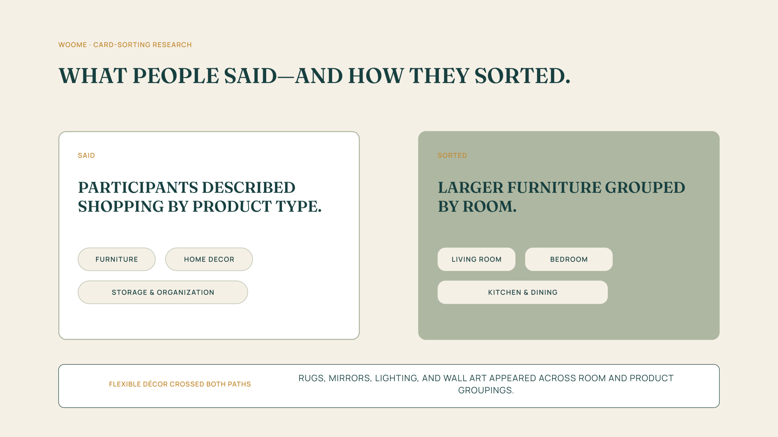
Before sorting, participants described shopping primarily by product type. During the exercise, many organized foundational furniture around rooms. Rugs, mirrors, lighting, and wall art behaved differently, appearing across both room and product groupings.
That contradiction became the center of the project
HOW I INVESTIGATED
Study the market. Then test the mental model.
I reviewed Wayfair, Crate & Barrel, and Burrow to identify common navigation patterns, familiar category language, and points of friction. I then conducted seven card-sorting sessions—six virtual and one in person—supported by pre- and post-session questions.
This let me compare what the market taught users to expect with how participants organized the information for themselves.
WHAT THE BEHAVIOR REVEALED
Furniture is contextual. Décor is fluid.
Rooms create context.
For larger pieces, participants often began with the space they were furnishing rather than an isolated product category.
Décor crosses boundaries.
Rugs, mirrors, lighting, and wall art appeared in multiple groupings, suggesting that people expect more than one path to these items.
Familiarity still matters.
Product categories remained useful. The goal was to add flexibility without making the navigation unfamiliar or repetitive.
FROM INSIGHT TO STRUCTURE
Two entry points. One coherent catalog.
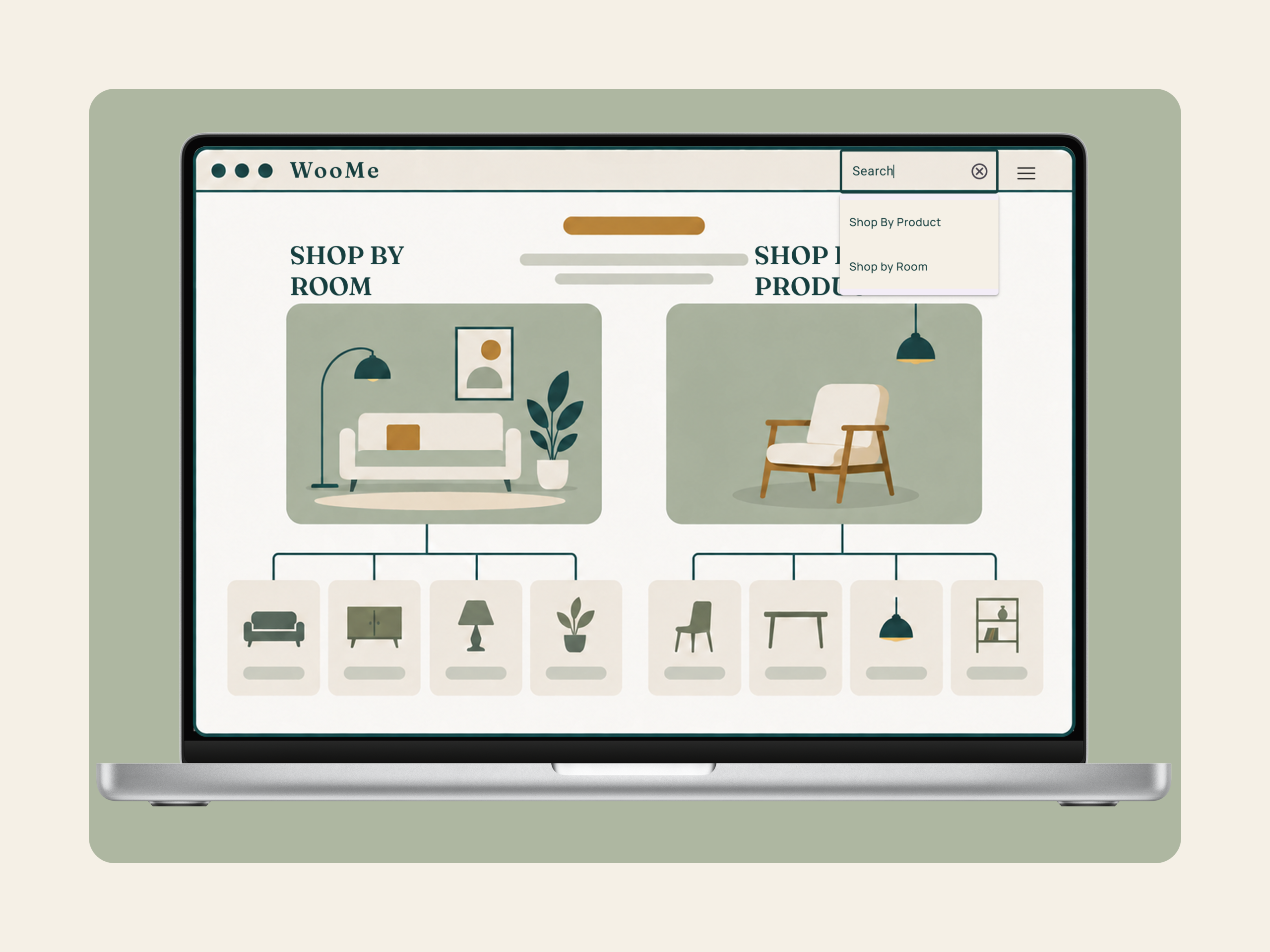
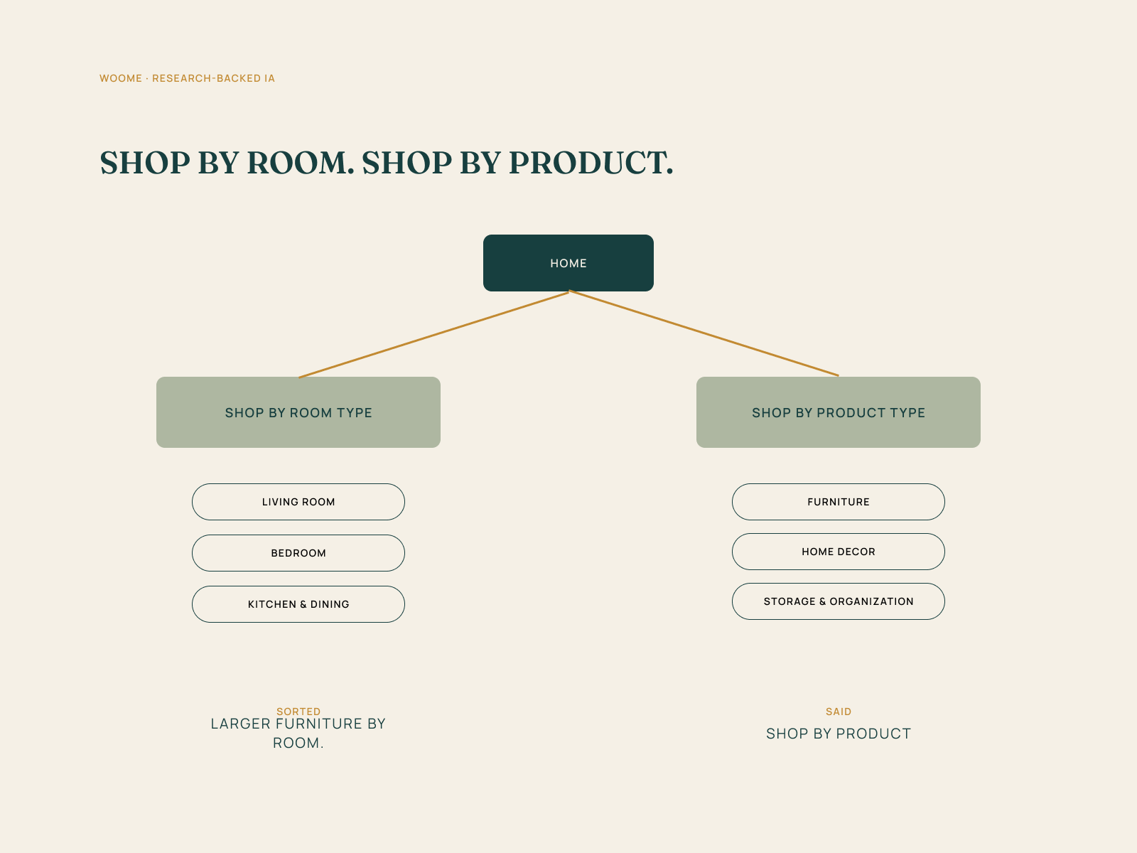
I proposed primary paths for Shop by Room and Shop by Product, with flexible décor cross-listed where people expected to find it. The structure preserves familiar retail language while better matching the contexts people use to make decisions.
OUTCOME
A research-backed sitemap, ready for prototyping.
The result was a recommended information architecture—not a completed redesign. The research supported a dual-path browsing model and clarified where universal décor needed flexible placement.
TEST NEXT
What the next study should answer.
The next step would be to prototype representative shopping tasks and test whether people can predict where an item belongs, move between room and product paths without losing context, and understand cross-listed décor without confusion.
Reflection
Behavior gave the clearer answer.
WooMe reinforced a lesson I return to often: people may describe one habit and demonstrate another. Good research creates room for both—and good design makes the resulting choice easier to understand.
The important decision was not choosing room-first navigation over product-first navigation. It was recognizing that both models were valid in different moments and designing a system that could support them together.
PREVIOUS CASE STUDY
Aventi
From a broad opportunity to a tested high-fidelity MVP in six weeks.
NEXT CASE STUDY
BreatheSpace
See how a 28-person survey shaped a flexible, low-friction direction for mindfulness support.